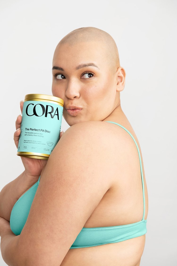
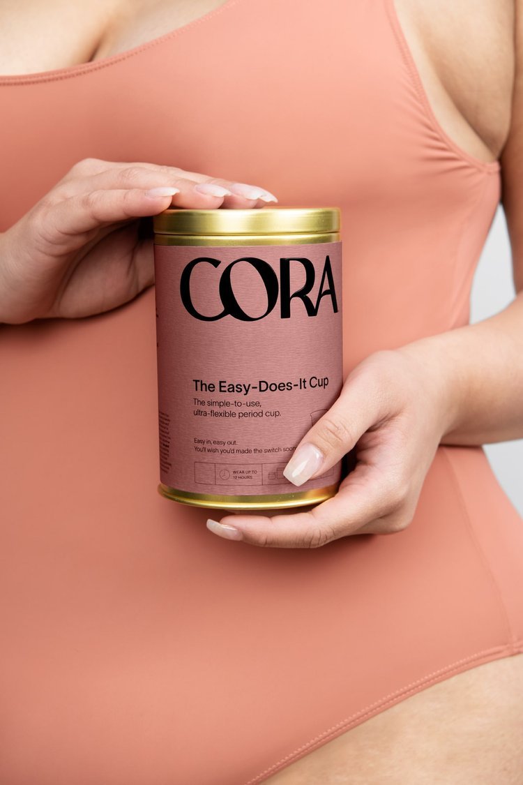
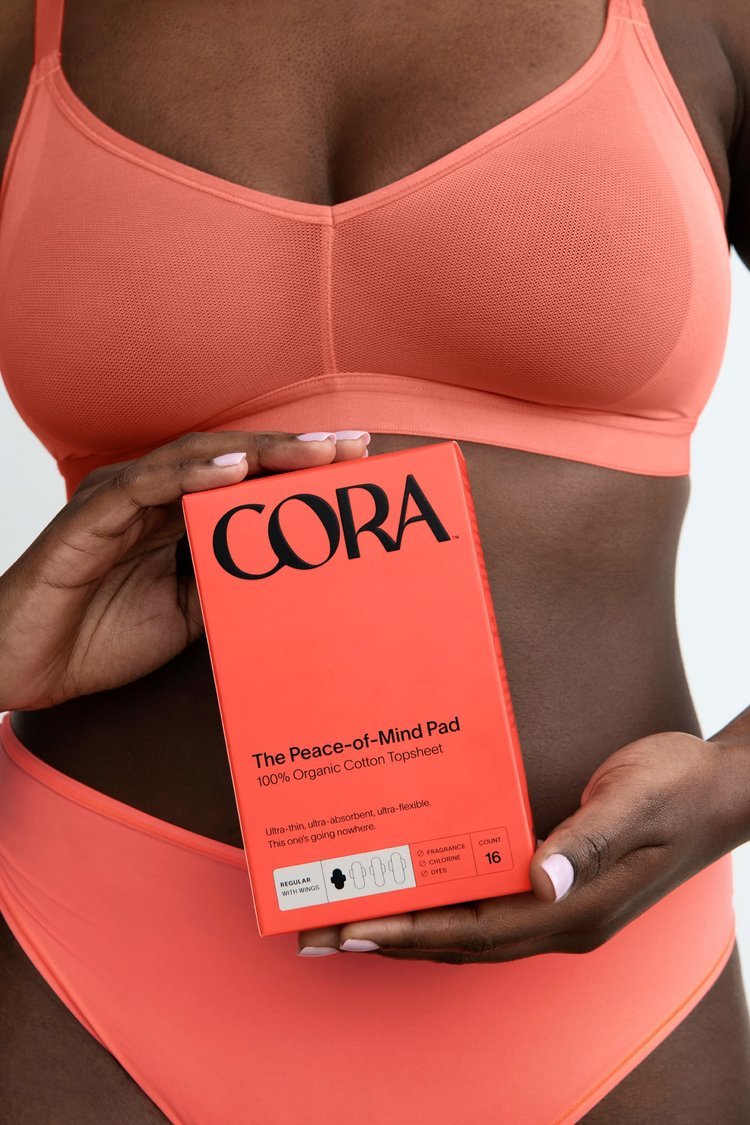
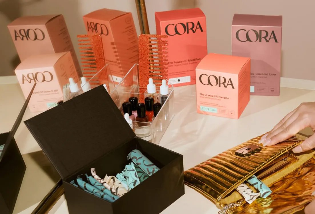
Cora Rebrand: Packaging
In 2022, in a fast-changing natural period care market, Cora’s rebrand reclaimed its stand-out on shelf, reinforced its relevance to the millennial consumer and cemented its place as a leader in the period care category.
The new identity gave Cora’s packaging, tone of voice and communications a bold look and feel, positioning it as the brand that shifts the conversation to a more relatable and personal one, rooted in comfort.
I worked with the agency Mother - London and Cora’s VP of Creative and Creative Director to form the direction and rules for the packaging, and execute the new designs across all 100+ SKUs, ensuring consistency and a high print quality throughout.
Art direction + Design: Elisa Massenzio, Andrea McCulloch, Morgan Sterns, Mother - London
Production: Elisa Massenzio
Photography: Molly Matalon | Renderings: Mother - London
Designed using Adobe Illustrator.
“The rebrand from early disruptor Cora toes the line between Gen Z candor and millennial polish.”
— Rachel del Valle, AIGA Eye on Design


“Period product and wellness brand Cora rebrands to feel more like self care.”